MARIPANELA
Traditional Panela Brand Redesign Process
 Context
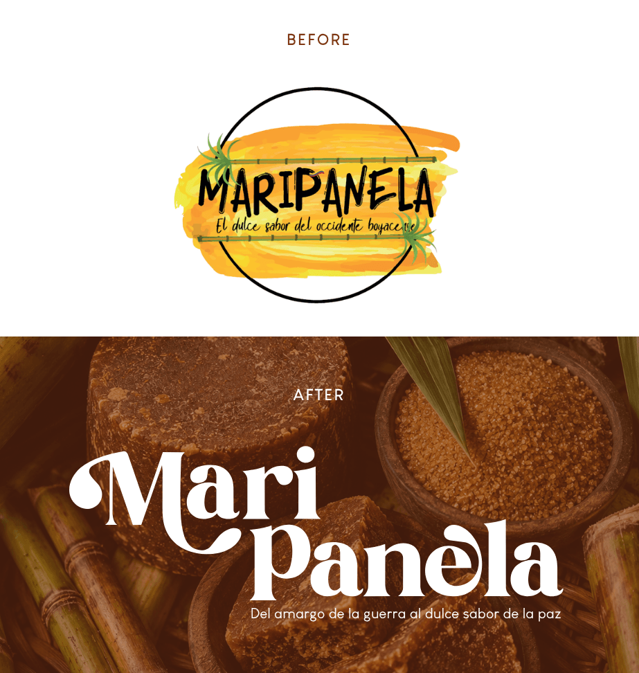
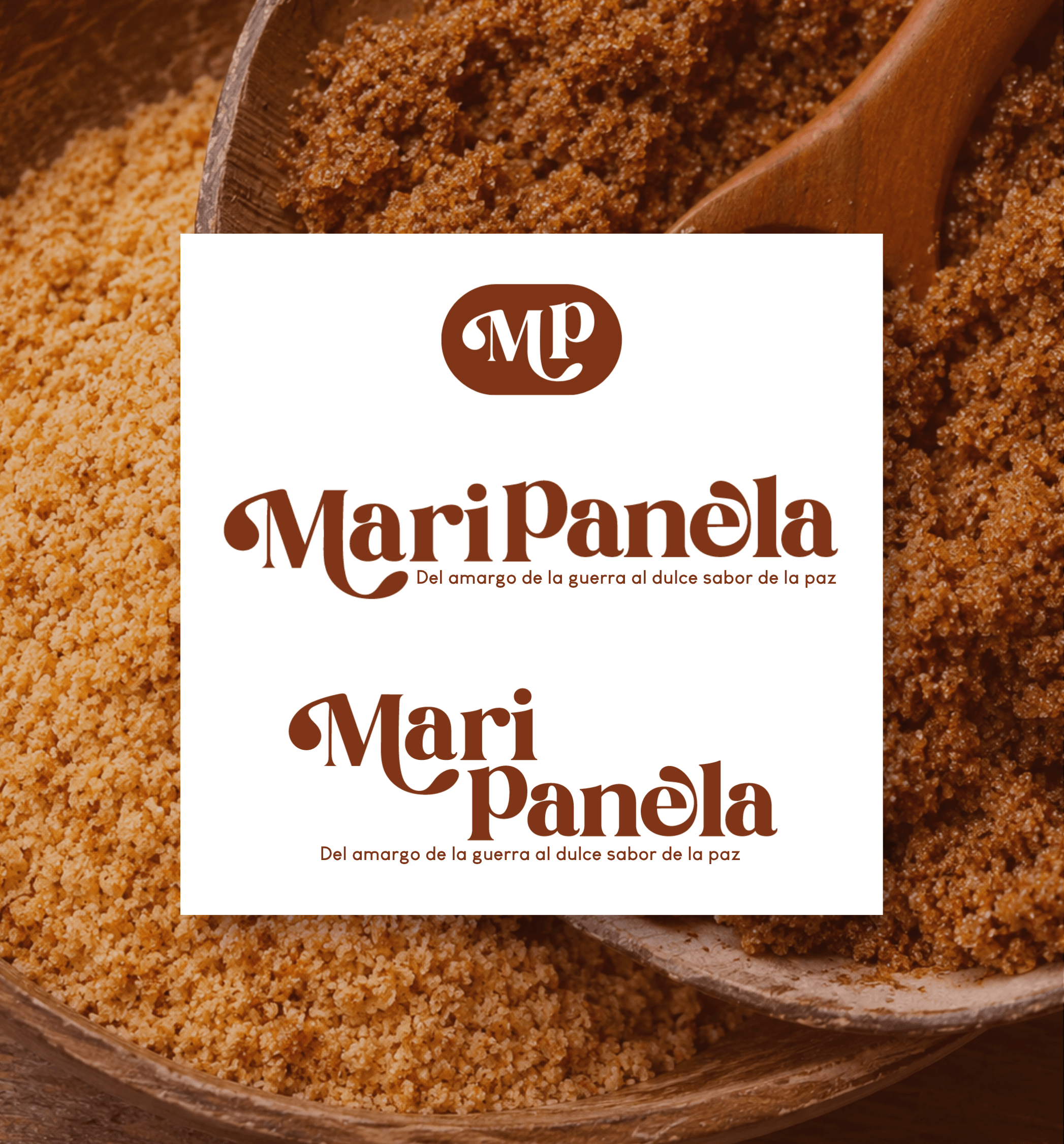
Maripanela is a brand redesign project developed for a traditional panela producer under the slogan "Del amargo de la guerra al dulce sabor de la paz" — the previous logo suffered from legibility issues, a cluttered watercolor background and disorganized decorative elements, calling for a complete rebuild of its visual identity.
Strategy
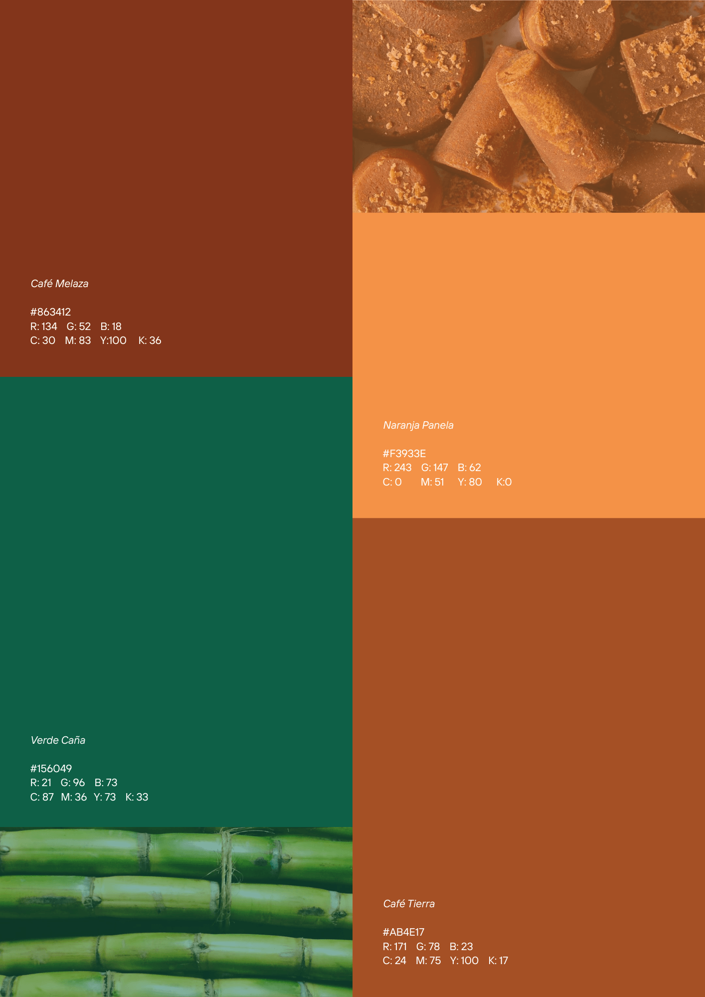
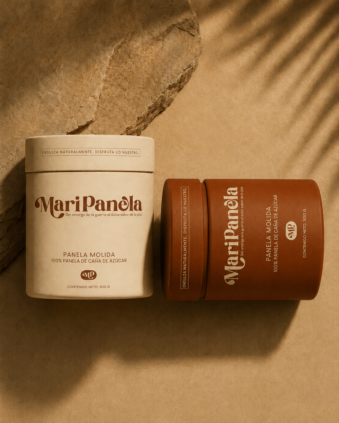
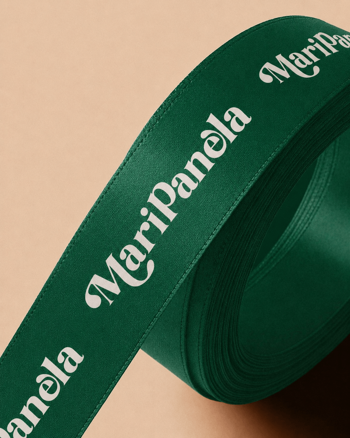
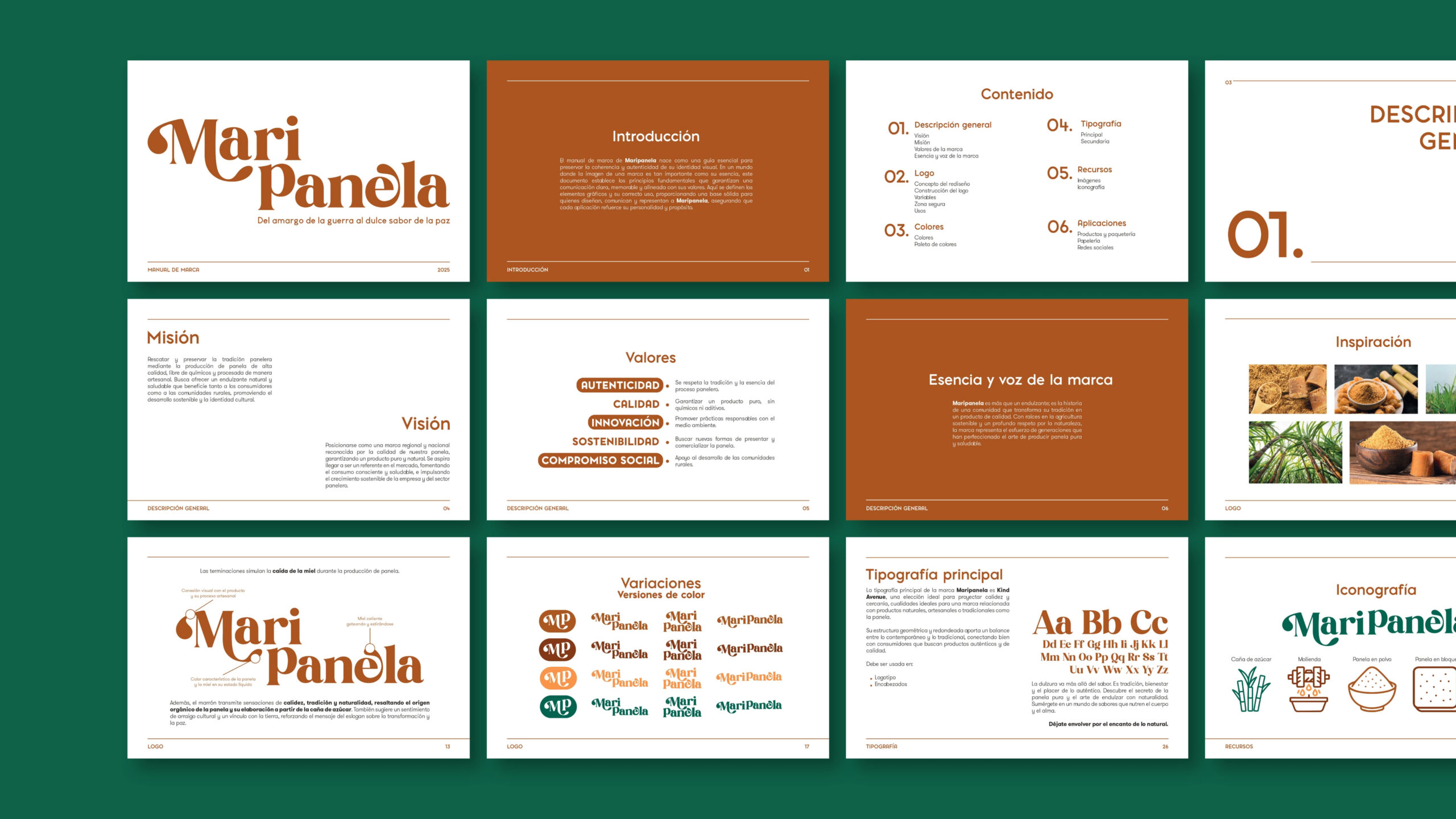
The new identity was built around the artisanal process of turning sugar cane into panela, using a serif typeface with organic, dripping terminations that evoke hot honey falling during production, paired with a warm and earthy color palette of molasses browns, panela orange and cane green to communicate tradition and authenticity.
Implementation
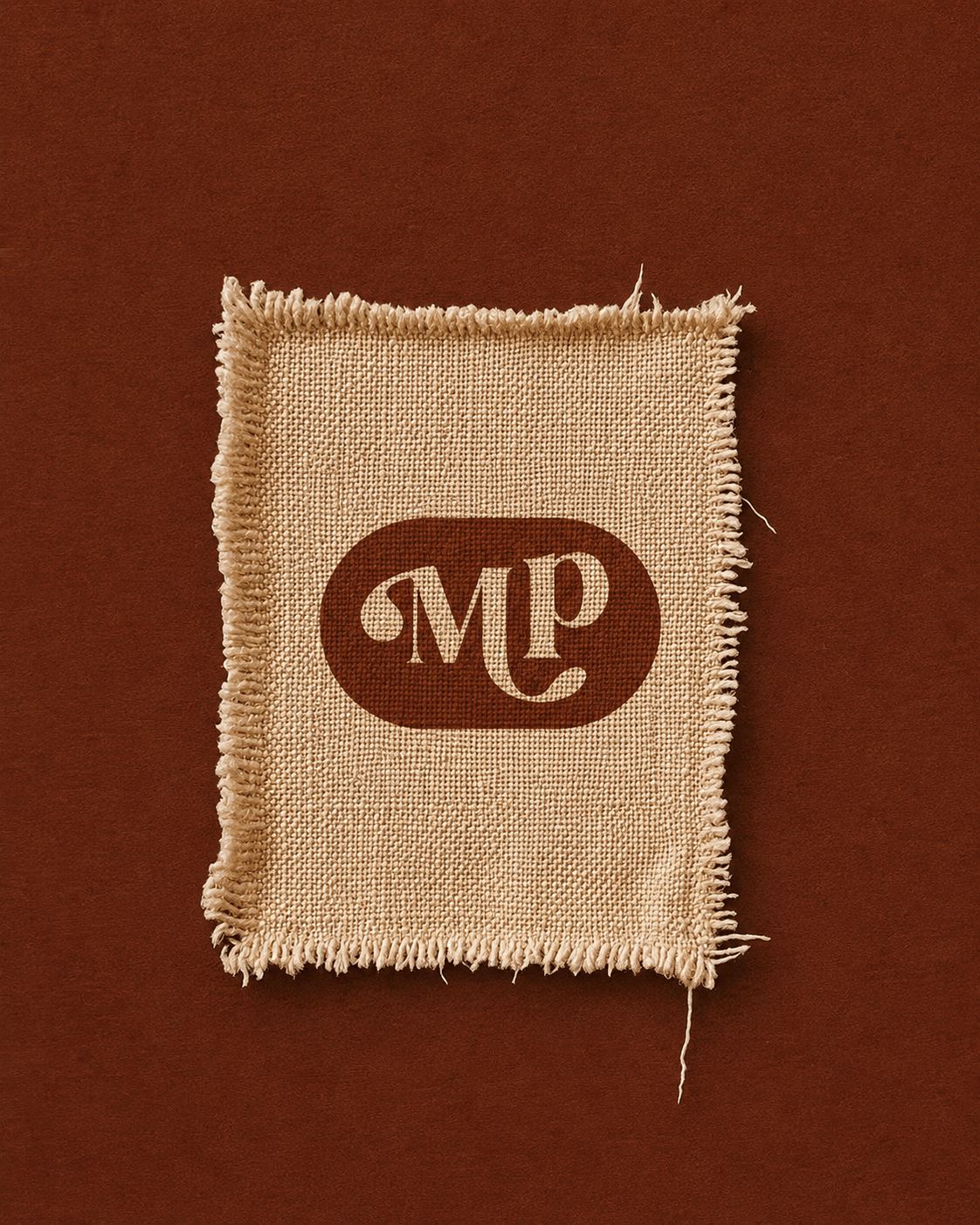
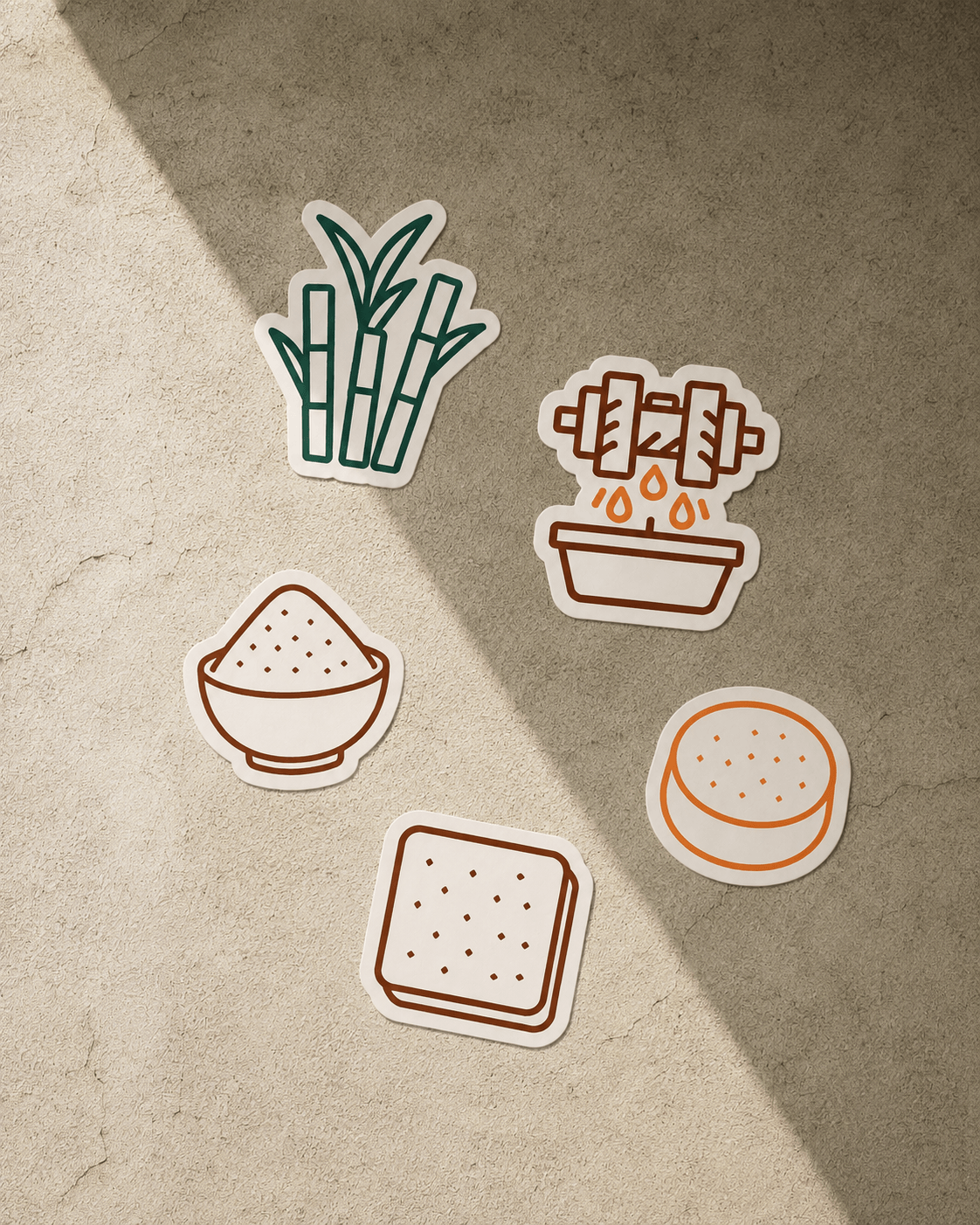
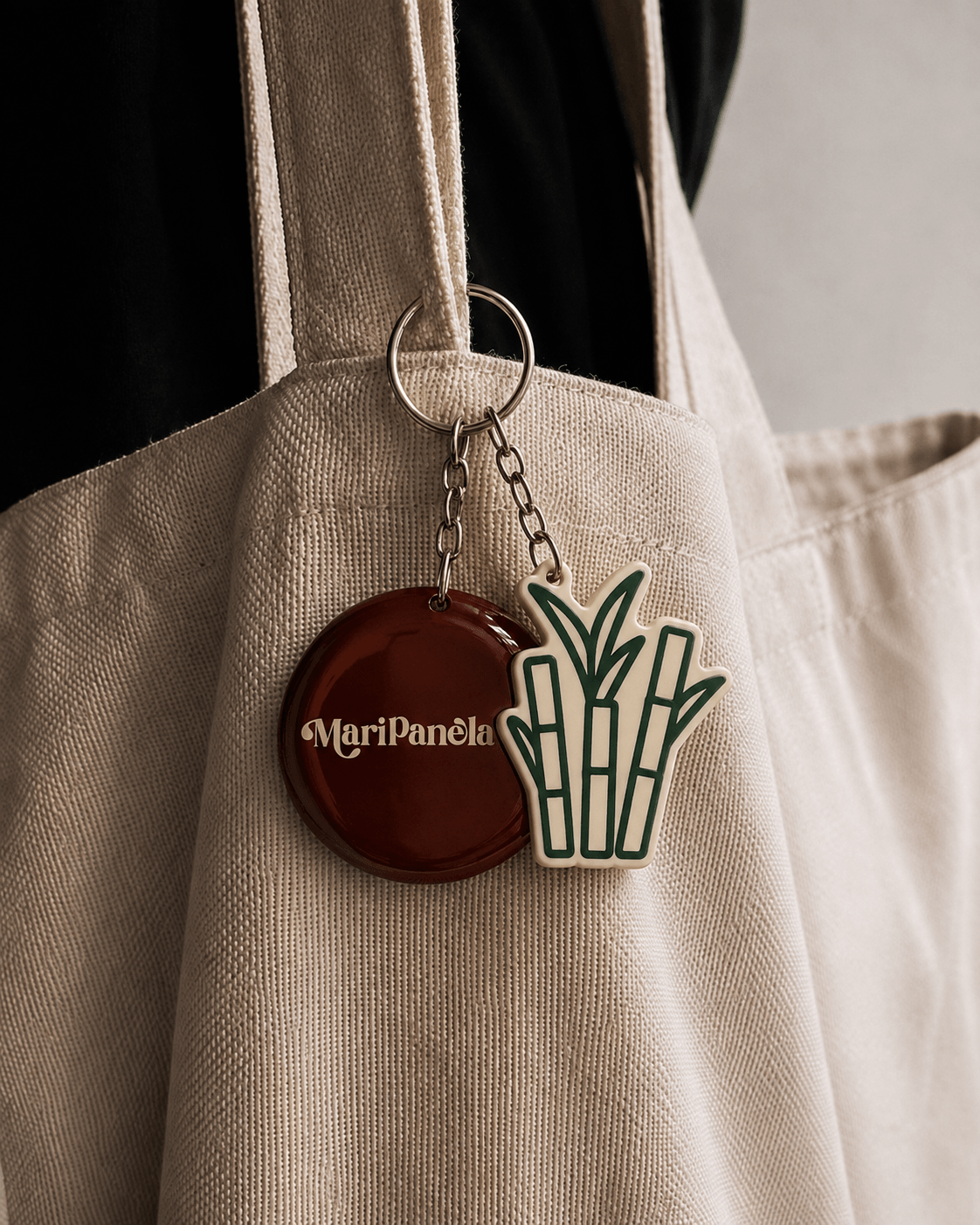
The brand identity was developed in Adobe Illustrator through a comprehensive visual system that included logo construction and clear space, color and typography guidelines, positive and negative versions, and custom iconography tracing the panela process from sugar cane to finished block, powder and round formats.
Outcome
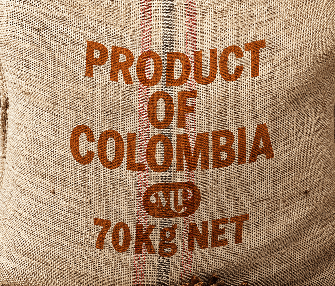
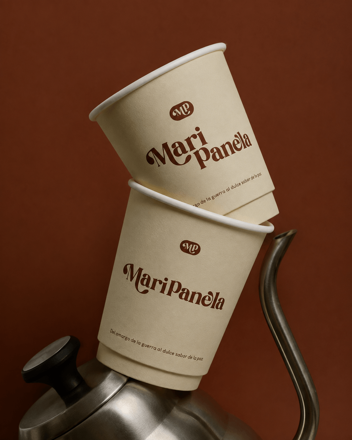
The final outcome is a complete brand manual for Maripanela that positions it as a regional and national reference for pure, chemical-free panela — from packaging and stationery to signage and social media, every application reinforces the brand's warmth, craftsmanship and connection to rural communities.
Project Overview
As the Brand Designer for this project, I led the entire creative process, from diagnosing the previous logo's issues to defining the mission, vision and values, redesigning the logotype and its construction, building the color and typography system, and producing packaging and application mockups for a cohesive brand experience.